Colour Space
–
Mapping Colour’s Dimensions
Hue, saturation, and lightness demonstrate that visible colour is
three-dimensional. These attributes provide three co-ordinates that can be used
to 'map' visible colour in a colour space. The early-20th Century artist A. H.
Munsell – creator of the Munsell Colour Charts – is credited as a pioneer of
intuitive three-dimensional colour space descriptions. There are many different
types of colour spaces that are based on or resemble Munsell’s designs.
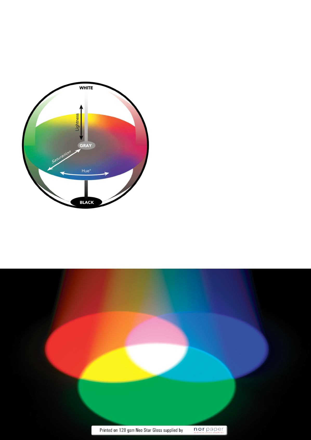
Basically, a colour space based on hue, saturation (or chroma), and lightness
(or value) uses cylindrical co-ordinates. Lightness is the centre vertical axis and
saturation is the horizontal axis that extends from the lightness axis. Hue is the
angle at which the saturation axis extends from the lightness axis.
We can apply the relationship between wave attributes and colour attributes to
a three-dimensional colour space. Wave amplitude determines a colour’s position
on the lightness axis; wave purity determines its location on the saturation axis;
and wavelength determines hue angle. Around the 'equator' lie vibrant, pure
hues. As the hues blend together toward the centre, they become less pure and
lose saturation. On the vertical axis, colours of different hue and chroma become
lighter or darker. The lightness extremes of white and black lie at the 'poles.' And
of course, at the centre of it all lies neutral grey – where white, black, and all
hues meet and blend together.
Tristimulus Data
A colour space can be used to describe the range of visible or reproducible
colours – or gamut – of a viewer or device. This three-dimensional format is
also a very convenient way to compare the relationship between two or more
colours. Later, we’ll see how we can determine the perceptual 'closeness' of
two colours by the distance between them in a colour space. Three-dimensional
colour models and three valued systems such as RGB, CMY, and HSL are known
as tristimulus data.
Locating a specific colour in a tristimulus colour space such as RGB or HSL is
similar to 'navigating' around a city using a map. For example, on the HSL colour
space 'map,' you first locate the intersection where the Hue angle meets the
Saturation distance. Then, the Lightness value tells you what 'floor' the colour
is located on: from deep below ground (black) to street level (neutral) to a
high-rise suite (white). In many applications, the intuitiveness of tristimulus colour
descriptions makes them a convenient measurement alternative to complex
(yet more complete and precise) spectral data. For example, instruments called
colourimeters measure colour by imitating the eye to calculate amounts of red,
green, and blue light. These RGB values are converted into a more intuitive
three-dimensional system where relationships between several colour
measurements can be easily compared.
However, any system of measurement requires a repeatable set of standard
scales. For colourimetric measurement, the RGB colour model cannot be used
as a standard because it is not repeatable – there are as many different RGB
colour spaces as there are human viewers, monitors, scanners, and so on (it
is, as we’ll discuss later, device dependent). For a set of standard colourimetric
measurement scales, we turn to the renowned work of the CIE – the
Commission Internationale d’Eclairage.
Having explored the measurable properties and attributes of colour, the next part
of the article will study the established CIE standards upon which most industrial
colour communication and measurement is based.
I
57


