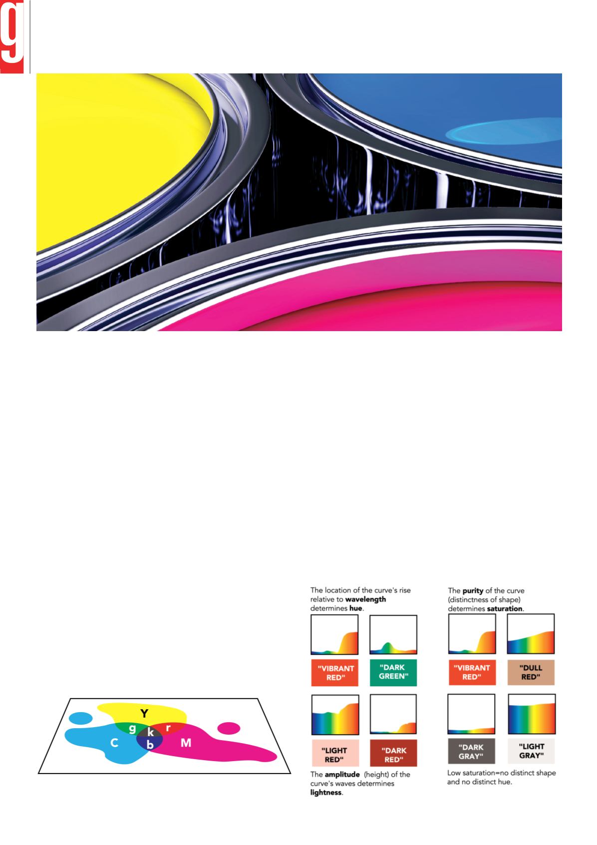
Newer flat-panel and traditional CRT monitors use different technologies to
produce a range of different colours.
Like the human eye, these devices must also process a large amount of colour
information at once – on screen or on paper. In logical fashion, these devices
imitate the eye’s response to the additive primaries to create a colourful illusion:
For example, a monitor blends varying intensities of red, green, and blue light at
each of its tiny pixels. These pixels are so small and tightly packed that the eye’s
RGB response is 'fooled' into the perception of many different colours when really
there are only three.
CMY and CMYK – The Subtractive Primaries
Monitors and scanners can employ the additive colour system because they are
emissive devices – they can directly add red, green, and blue light to darkness.
Printers, on the other hand, must render colours on paper and other substrates,
so they must work with reflected light. To do this, printers employ the opposing
subtractive primaries of cyan, magenta, and yellow.
In the visible spectrum, cyan is directly opposed to red; magenta is the opposite
of green; and yellow is the opposite of blue. When cyan, magenta, and yellow
pigments are deposited on a white, reflective substrate, each completely absorbs
– or subtracts – its opposing counterpart from the oncoming white light. For this
reason, the printing process uses cyan, magenta, and yellow inks to control the
amount of red, green, and blue light that is reflected from white paper.
These colours are printed on paper as separate layers of halftone dot patterns.
The illusion of different colours and tones is created by varying the size, balance,
and angle of the dots. The effects of varying dot sizes is similar to the varying
intensities of a monitor’s red, green, and blue phosphors.
This diagram demonstrates how the subtractive primaries remove their additive
counterpart from light to produce the appearance of a colour:
HSL — The Three Dimensions of Colour
So far, we’ve learned that colour consists of complex wavelength information,
and that the human eye, monitors, and printers, convert this complex information
into three-value systems of primary colours in order to simplify processing and
rendering of that information. Another way to simplify colour description is to
describe its three attributes or 'dimensions:'
• Hue – its basic colour, such as red, pink, blue, or orange.
• Saturation – its vividness or dullness.
• Lightness – its brightness or darkness.
Light waves also have three attributes that directly affect the attributes of hue,
saturation, and lightness. Of course, wavelength determines the colour’s hue;
wave purity determines saturation; and wave amplitude (height) determines
lightness.
Spectral curves demonstrate the relationship between wave attributes and the
way we perceive these attributes.
Vibrant, colourful objects reflect a distinct part of the spectrum at high intensity;
objects that are near-white or light grey reflect most of the spectrum uniformly
and at high intensity; dark grey, dark brown, and black objects absorb most of
the spectrum’s energy; and so on.
Vol 5 Issue 1 • STREAMLINED COLOUR MANAGEMENT COLOUR COMMUNICATION
56
I
The GAPP
magazine
www.
thegapp
.co.za


